Making the Point of No Return Clearer
Role
Product Designer
Timeline
1-week sprint
Team
Solo
Skills
Figma
Interaction Design
Claude Code
Overview
Guests were leaving right before they booked.
Problem
In a one-week design sprint, I worked on Airbnb’s booking experience. Data showed some guests abandoning the flow right before completing a reservation, and uncertainty, overload and decision fatigue were all playing a part.
Solution
I redesigned three screens near the end of Airbnb’s booking flow, making insurance coverage easier to understand and giving guests a clearer picture of what they’re agreeing to before paying.
Making travel insurance easier to evaluate.
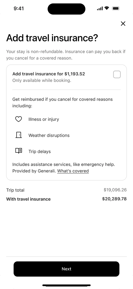
Instead of listing coverage separately, I brought the key benefits, exclusions, and price into the same view so guests could better understand what they were paying for.
A cancellation policy people can actually read
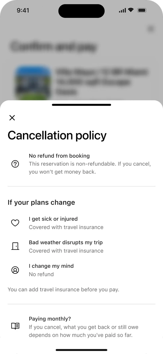
“After Jan 16, 11:31 AM” becomes “No refund from booking,” with real situations and what happens in each.
A calm, clear moment to commit
No urgency badges or floating buttons. The full price and the refund rule sit right above Pay, and guests see what happens next.
Auditing the Flow
The riskiest screen was the hardest to read.
I walked through the full flow for a $19,096 non-refundable stay, from deciding on a place to paying for it, and counted what each screen told a guest.
“Non-refundable” appeared five times and was never explained. The $17,144 listing price showed up three times before the real $19,096 total, and insurance was never once connected to the risk of a stay guests couldn’t cancel.
Key Findings
Guests were asked to commit before they could see what they were committing to.
The total changed without explanation
Guests built expectations around $17k, then saw $19k. The breakdown only appeared at the bottom of the last screen.
“Non-refundable” was buried
The most important fact about a $19k purchase sat low on the page, with no reminder at the moment of paying.
The last screen repeated the review
A floating Review button looked like the main action, and nothing said what would happen after paying.
Focus
Every finding came back to the moment of payment.
So I focused on the commitment moment: the Confirm and pay screen, and the cancellation and insurance screens it depends on. Before tapping Pay, without scrolling or opening a link, a guest should be able to answer how much they’re paying and how much is charged now, whether they can get their money back if their plans change, and what happens after they tap Pay.
Cancellation policy
+ travel insurance
Confirm
and pay
Deciding
Reviewing
Setting up
payment
Paying
Design
From sketches to final designs.
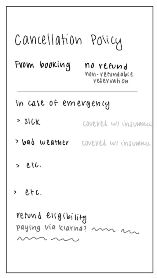
“In case of emergency” became “If your plans change,” with a no-refund case added
Klarna refund eligibility became a plain “Paying monthly?” note
Cancellation policy
“After Jan 16, 11:31 AM” became “No refund from booking.” A new “If your plans change” section walks through common situations, always including the no-refund case.
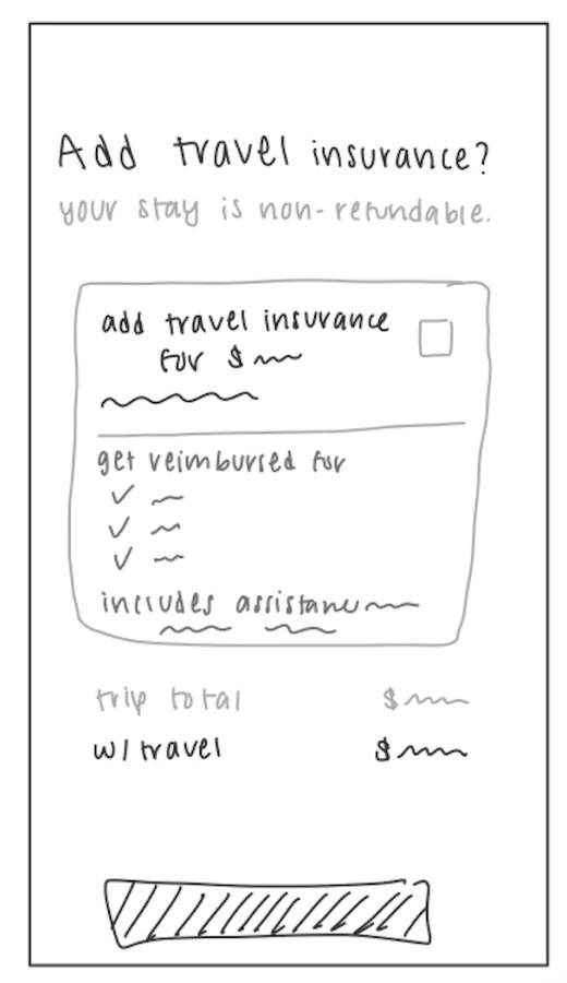
Explained what insurance does: it can pay you back if you cancel for a covered reason
Kept the trip total shown both ways, with and without insurance
Add travel insurance
“Yes, add peace of mind” became a neutral “Add travel insurance,” with the total shown both ways ($19,096 or $20,290) before guests decide.
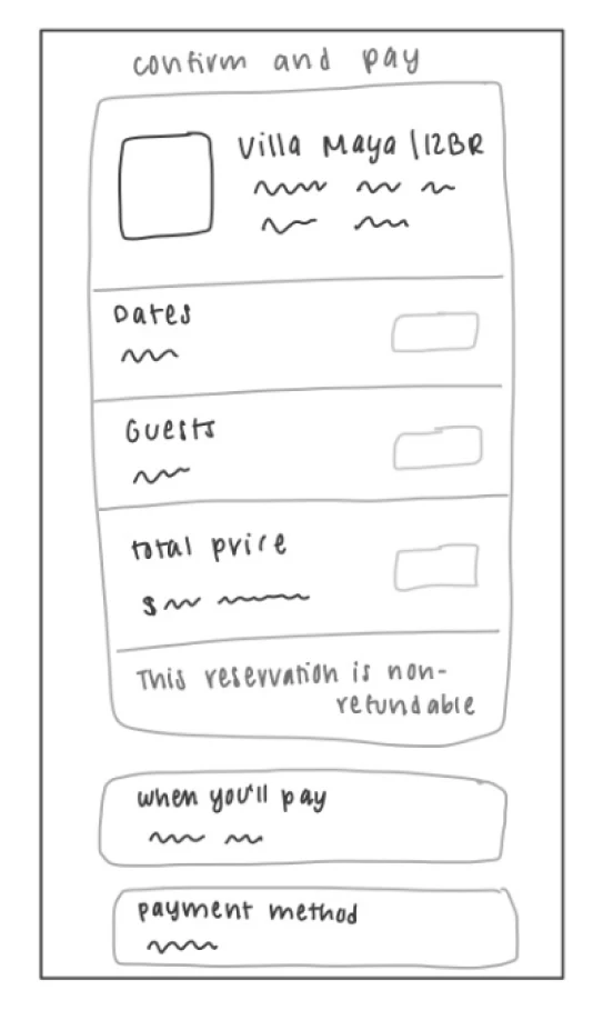
Kept the non-refundable line in the trip card, now linking to the full policy
Pinned the total due today next to Confirm and pay
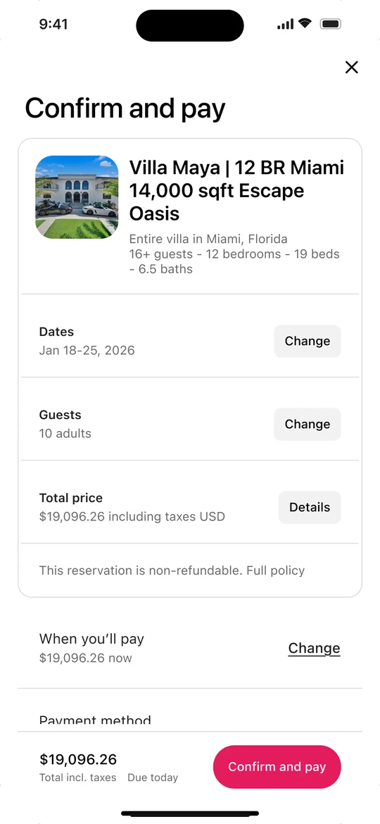
Confirm and pay
Removed the floating Review button and the duplicate price link, so Pay is the only main action. A non-refundable reminder sits right above it, where the consequence meets the action.
States
Designing past the happy path.
I covered what changes when insurance is added, how the Pay button behaves while processing or after a failed payment, and how the policy screen reads for a flexible booking instead of a non-refundable one.
Handoff
Annotated for engineers, honest about the assumptions.
I annotated every change for developers and wrote down what I was assuming. There was no user feedback in the brief, so the findings came from my own heuristic review. The insurance wording would need review from Legal and the insurance partner, and I assumed that removing urgency cues at checkout wouldn’t meaningfully hurt conversion.
What I’d Do Next
Test whether guests can answer the three questions.
I’d run a comprehension test with 5–8 people: before paying, can they state the total, whether they can get money back, and what happens next? Then I’d explore the Klarna flow, edge cases for very expensive stays, an accessibility pass, and localization.