Making AI Health Insights Easier to Understand and Trust
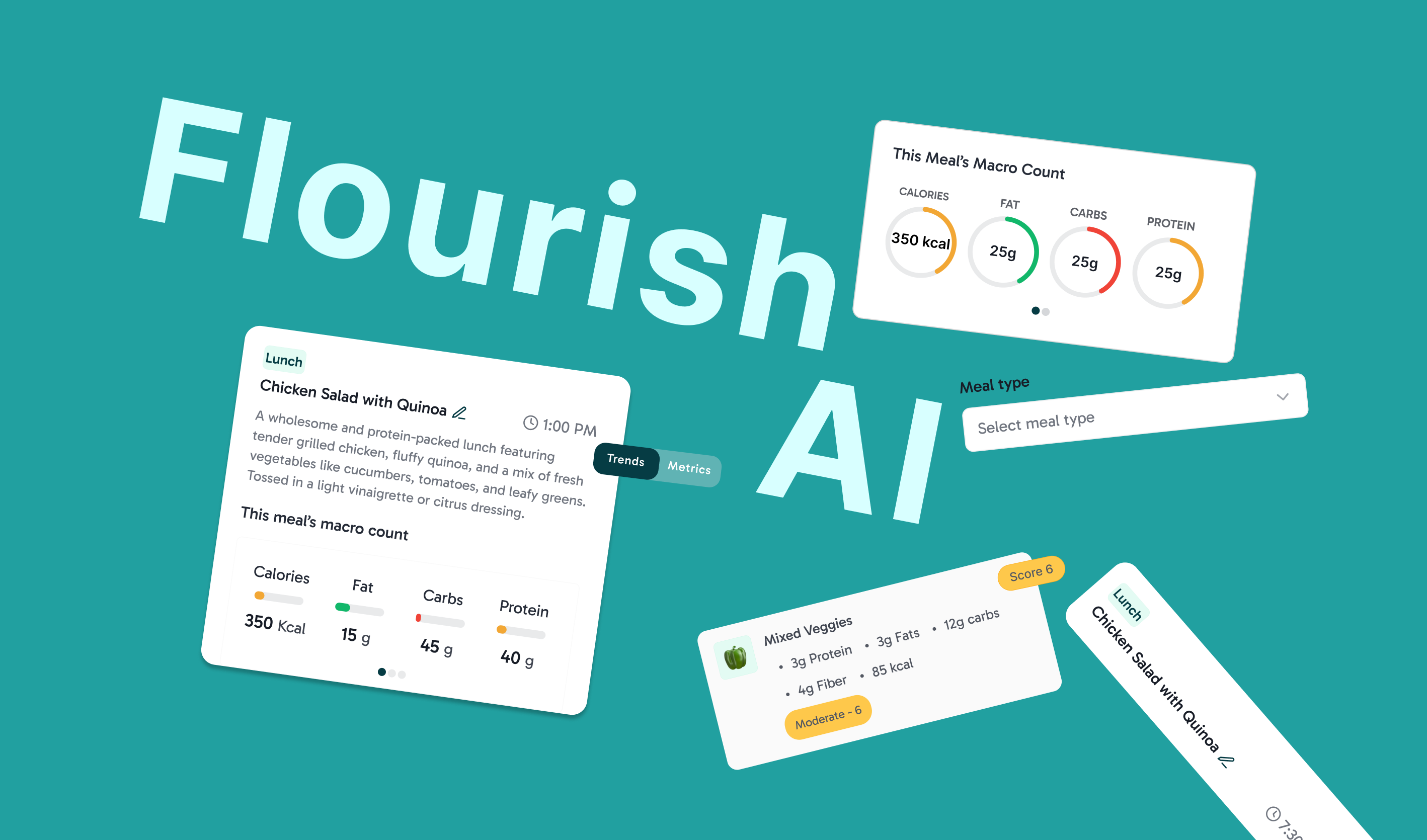
Redesigned the core meal experience for an AI gut-health startup, reducing insight interpretation time by 47% and improving trigger identification by 34%.
Jump to solution ↓Role
Product Design Intern
Timeline
Summer 2025
Team
2 Designers
2 Engineers
1 Product Manager
Skills
Product Design
User Research
Prototyping
Context
Logging food was easy but understanding what it meant wasn't.
Flourish uses AI to connect what users eat with how they feel.

But those insights are only useful if users can log meals accurately and understand why the product surfaces certain patterns. My internship focused on strengthening both sides of that loop.
What I Owned
I took the core experience from research to shipped design.
Research & Validation
Synthesized user interviews and usability tests to identify where AI-generated insights created confusion or mistrust.
Core Product Design
Led end-to-end design of the meal detail experience, including trigger scores, macro visualization, and editing flows.
The Problem
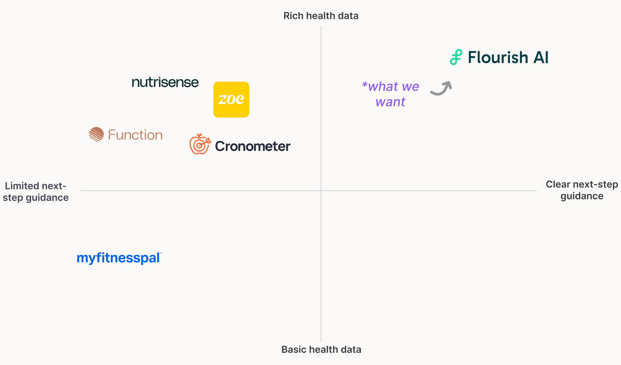
Every app I audited stopped at the data.
Across the 5 leading nutrition and meal-logging apps I audited, nutrition data was plentiful. What was missing was a clear connection between what I ate → how I felt → what I could do differently.
Research
More data wasn’t helping users make better decisions.
Across 15 interviews, the same pattern kept coming up: users had plenty of data, but struggled to turn it into something useful.
With so many trigger foods and different levels of them, it's impossible to keep track on my own. I need technology to remember for me, but it's falling short at connecting that to my symptoms.
IBS patient
I log everything and still have no idea what caused my flare-up last week. It feels like I'm just collecting data for nothing.
GERD patient
Drowning in data
Dense nutrition breakdowns make "insights" feel like a chore, not help.
Users needed insights specific to their body
Users wanted food triggers connected to their own symptoms, not generic nutrition rules.
The cause → effect link was missing
Users couldn't connect what they ate to how they felt, making AI-generated insights harder to trust.
Opportunity
Three ways to close that gap.
Explain the trigger
Don’t just assign a score. Help users understand why a food may affect them using their own patterns and data.
Make nutrition glanceable
Turn dense nutrition data into visual summaries users can understand immediately.
Reduce logging friction
Reduce the effort required to log accurately through fewer taps, smarter defaults, and less mental overhead.
Explorations
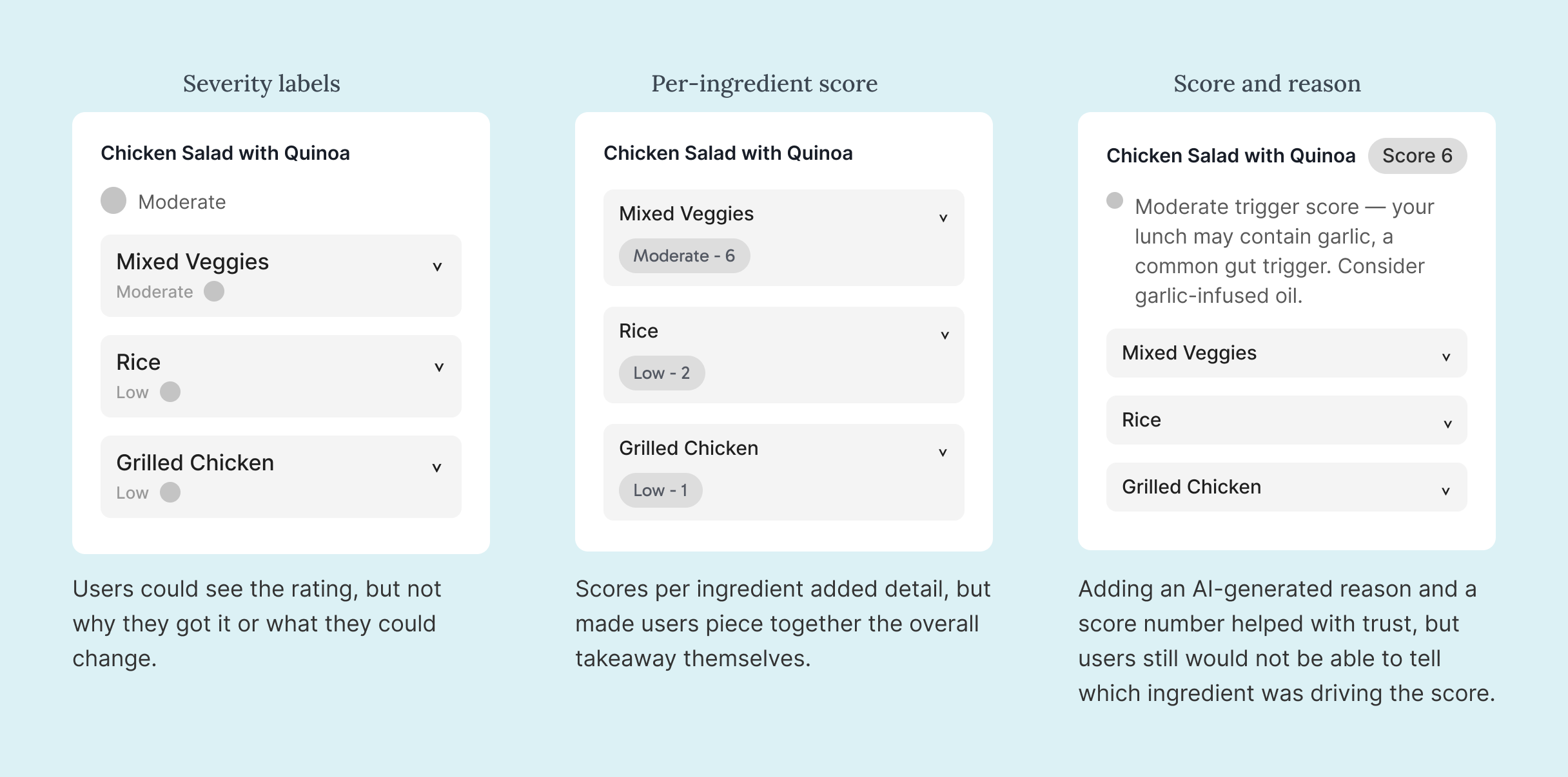
Three ways to explain the score, and what each one missed.
Explaining the trigger score was the opportunity I spent longest on. Each direction answered part of the problem and left another one open. What shipped put the per-ingredient scores and the reason together.
Design
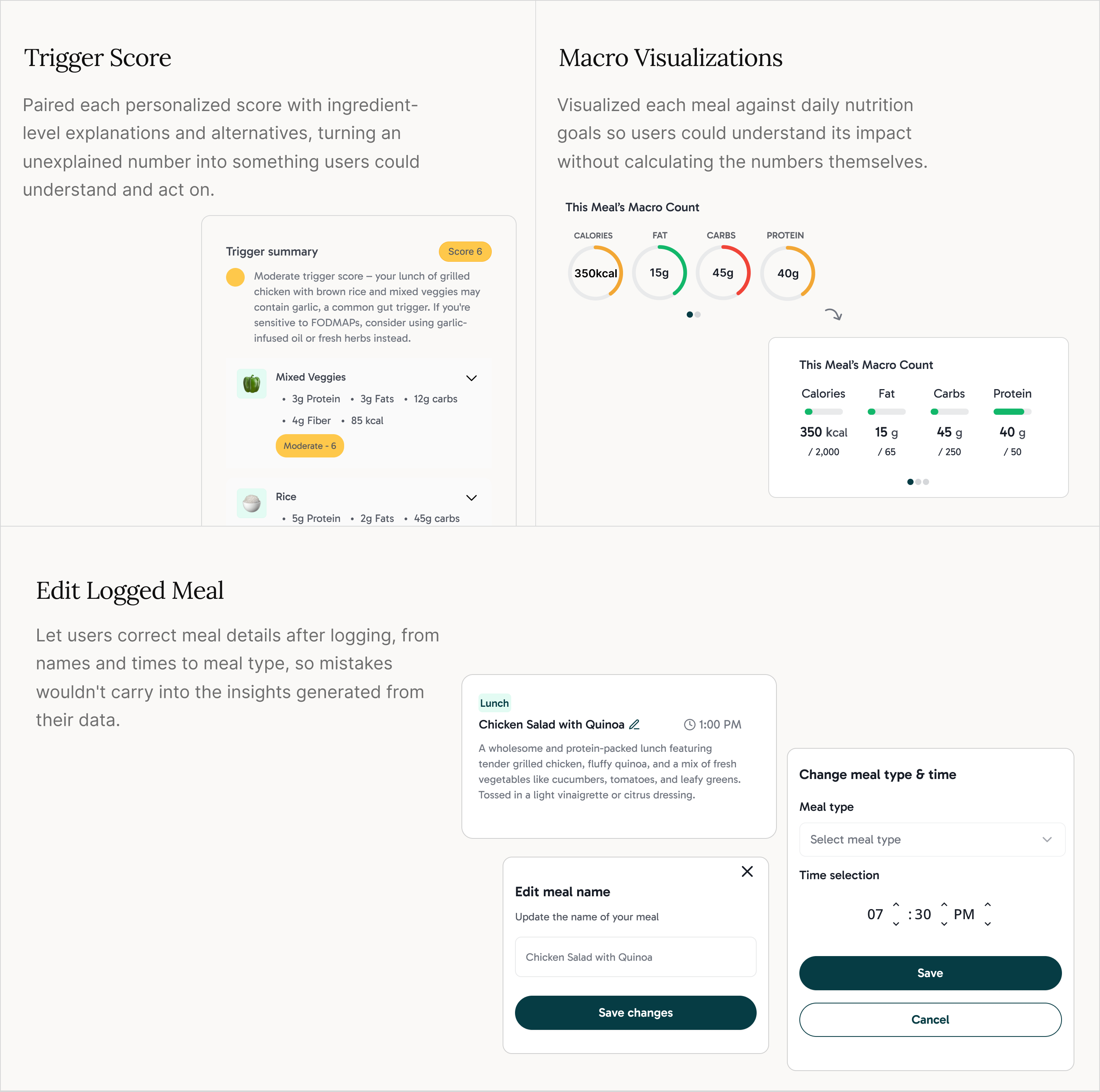
Each opportunity became a core part of the meal experience.
None of it required adding more information. I explained the numbers already on screen, made them scannable, and took steps out of logging.
Testing & Iteration
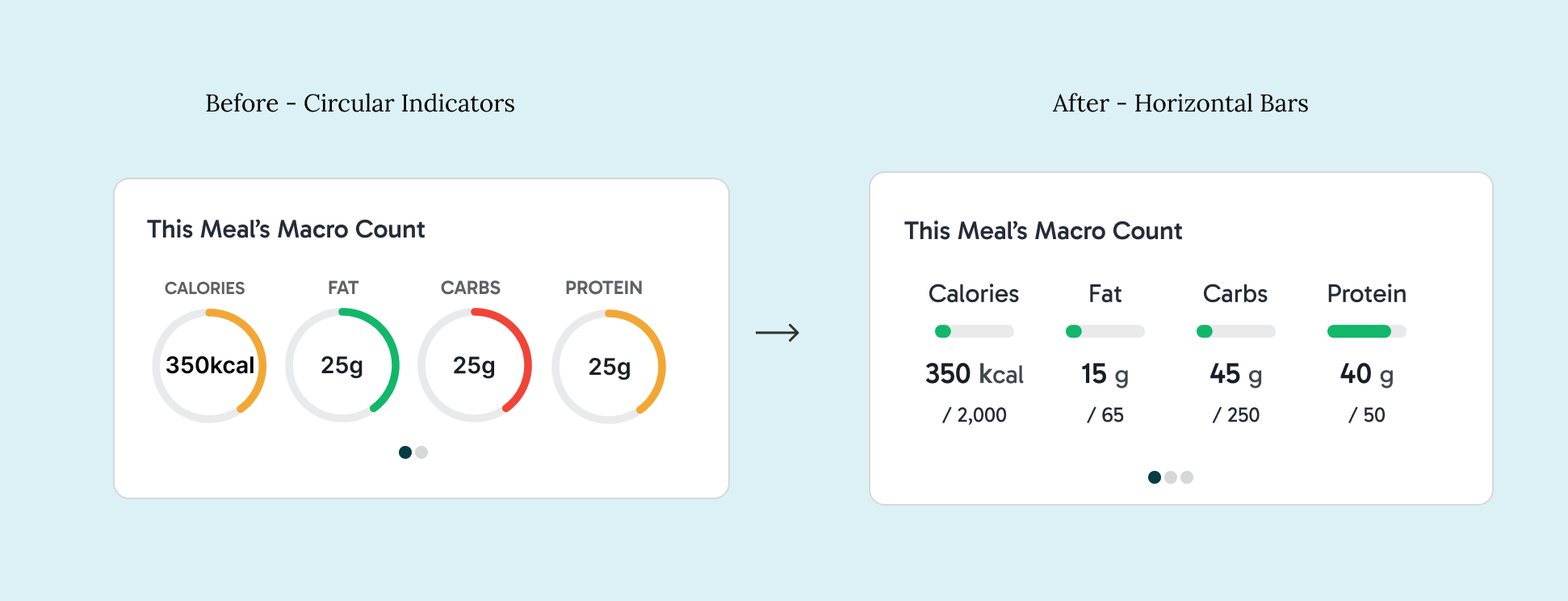
The macro visualization wasn't working.
Users misread the circular indicators because they couldn’t tell whether 45g of carbs was a lot and the arcs implied a scale without showing one. The color compounded it: carbs read red at 45g against a 250g target while protein read amber at 40g against 50g, so the palette implied a verdict that ran opposite to the numbers. Horizontal bars anchored each macro to its daily target, and dropping to a single fill let the target carry the judgment instead of the color.
Design Evolution
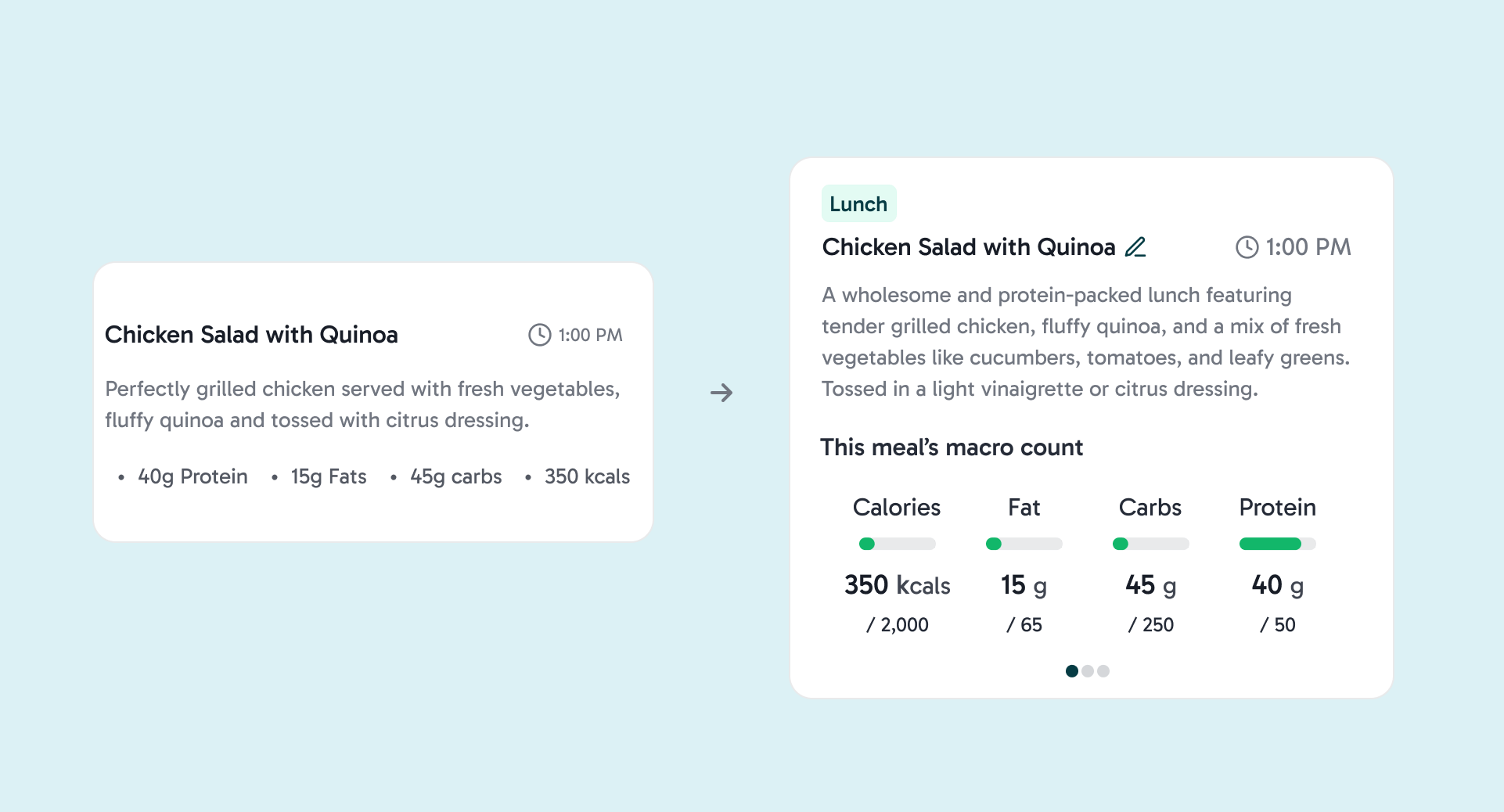
From showing data to helping users understand it.
The original card put every macro into one line, which made it hard to compare anything at a glance. I separated the macros into their own section and added daily targets so each number had some context.
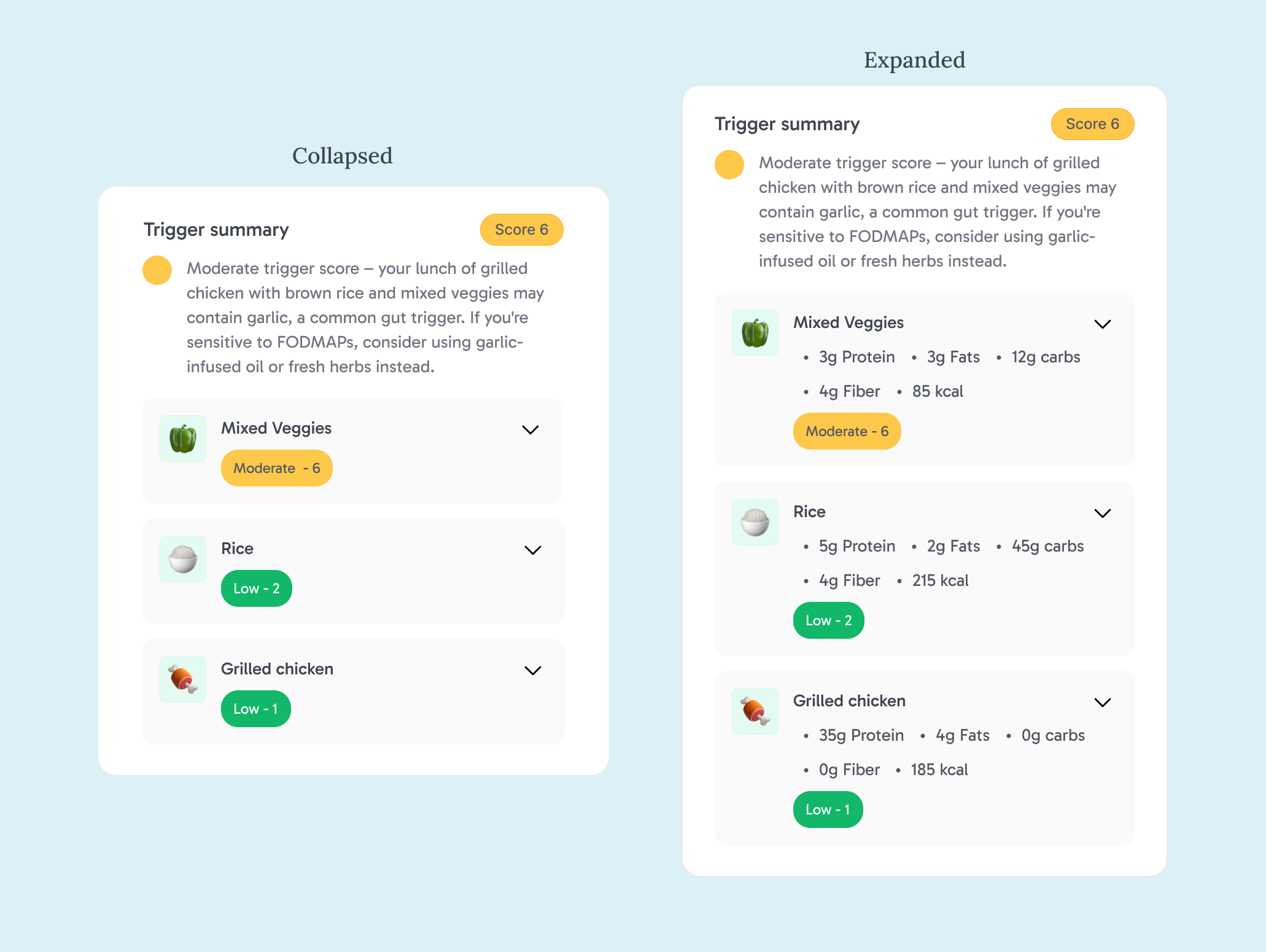
The card had to carry the whole story without burying it. Collapsed, it leads with the score and the reason behind it, so the takeaway is immediate. Expanded, each ingredient opens into its own macros and score, so users can see exactly what pushed the number up and what to swap.
The Solution
Now nothing on this screen needs interpreting.
The redesigned meal detail screen brings nutrition, trigger insights, and ingredient-level suggestions into one place. For launch, I worked with my product manager and engineers to simplify the tested macro visualization resulting in the daily targets coming off and the original macro colors coming back, while keeping the bar format users understood more easily. If I continued the project, I’d test bringing the daily targets back.
Impact
It shipped, and interpretation time dropped.
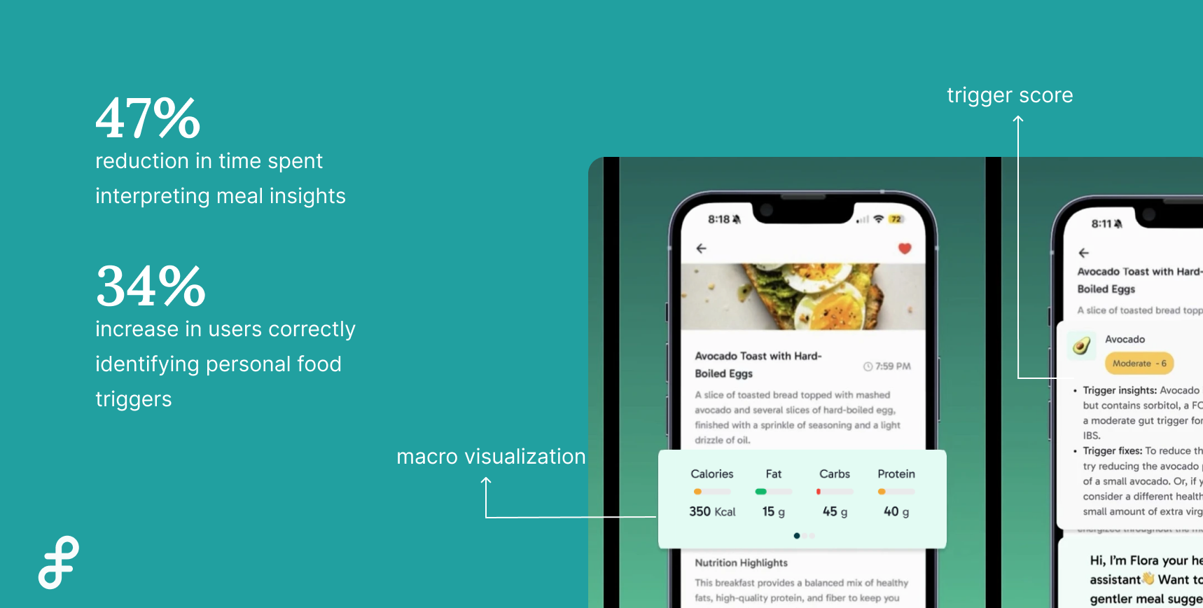
The redesigned meal experience shipped in Flourish AI and was featured in the product's App Store preview. In a comparative usability study with 8 beta users, the redesign helped users interpret meal insights faster and more accurately identify their personal food triggers.
Reflection
What this project taught me.
One thing this project really changed for me was how I think about being “right” as a designer. There were several times where I felt confident about an interaction or visualization, only for usability testing to show that users were reading it completely differently than I expected. By the end of the internship, I was much less attached to defending a design and much more interested in figuring out why someone was getting stuck. I also learned that simplifying a product isn’t the same thing as stripping information away. With health data especially, users still wanted the detail and just needed help knowing what mattered first. Designing and shipping the meal detail experience made me think much more about hierarchy, context, and how a design fits into a real product.